Tampa Bay continues at near-record levels in COVID-19 case rates, reaching a 2,799 per day average over the past 14 days on January 17.
The data comes from the COVID-19 Regional Re-Opening Dashboard published by the Tampa Bay Partnership (TBP), a coalition of Tampa Bay business leaders, as part of the collaborative State of the Region Initiative. While much less widely known than Hillsborough County’s and other county dashboards, this one is region-based and was originally established to provide a high-level snapshot and online tool to assist residents and policy-makers track official health metrics around COVID-19 to help guide the safe re-opening of the Tampa Bay economy.
And it appears to be a pretty useful tool for anyone trying to make sense of the multilayered statistics that have come to characterize pandemic reporting.
Designed by Dave Sobush, the Partnership’s Director of Policy and Research, the Regional Dashboard is updated with the latest statistics on COVID-19-related testing, cases, emergency room visits, and hospitalizations in the Tampa Bay area. It uses the same data as the State of Florida, just repurposed using Microsoft software for metrics that apply to the eight-county region. It also has county-specific graphics as well, which make for convenient visuals to compare these counties within the region.
Click here to view the State of the Region Re-Opening Dashboard.
In a recent interview with 83 Degrees, Sobush explained that the Tampa Bay Partnership, a public policy and advocacy organization, “tackles issues that go beyond county and municipal borders. Certainly the virus doesn’t know or see county boundaries” he says. The effort, he notes, “is part of a larger planning group, the State of the Regional Initiative, which collaborates with three other partners, the Community Foundation of Tampa Bay, United Way Suncoast, and USF Muma College of Business.”
The Regional Dashboard looks at data going back to April 2020. Other county dashboards, such as Hillsborough County’s COVID-19 Data Dashboard looks only at a 14-day window for cases and tests. The Regional Dashboard looks at four COVID-19 metrics useful in tracking the pandemic over a longer period of time including Weekly Testing, New COVID-19 Cases/Day, Weekly Emergency Department Visits, and Hospital Bed Availability. This statistical accounting applies to the eight-county region as a whole.
The graphics below tell the story
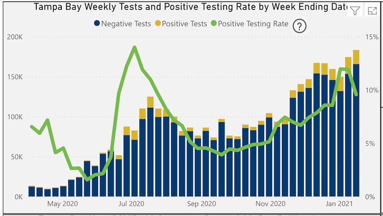
The first chart, “Tampa Bay Weekly Tests and Positive Testing Rate” provides a testing snapshot from April 2020 to January 2021. Each bar represents one week with the number of daily cases as averaged over the previous 14 days shown on the left. Positive tests are shown in yellow and negative cases in blue. This week the Tampa Bay region continued to trend toward near-record levels to date, reaching 17,590 new positive tests in the region on January 16.
![]()
The green line in this chart represents the “positive testing rate” or measure of the percentage change of new positive tests, which is listed on the right of the chart. Tampa Bay’s positive testing rate encouragingly dipped this past week to 9.58%, just below the 10% threshold outlined in state and federal re-opening guidelines. In the two prior weeks, the test rates showed a post-holiday bump up to near 12% positive testing rate, breaching the statewide reopening threshold for the first time since July 2020, according to Sobush.
![]()
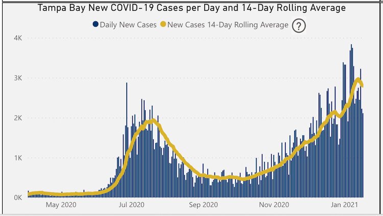
The second chart, “New COVID-19 Cases per Day,” shows daily new cases in Tampa Bay (blue bars), which initially peaked in late July and have reached their highest monthly totals since then. While rising sharply in early January 2021 and peaking at 3,839 new cases on January 7, cases have trended down since then to 2,223 new cases on January 16. The new case rolling average -- an average derived from the previous 14 days — and represented by the yellow line, reached an all-time high of 2,970 on January 13.
![]()
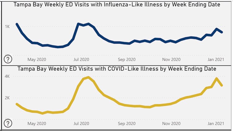
The third chart, showing “Weekly ED-Emergency Department-Visits” shows visits for patients with flu-like symptoms above (blue line) and those with visits for typical COVID-19 symptoms below (yellow line). The COVID-19 visits graphic shows a steady upward trend reaching a peak in visits on January 2, nearly as high as the earlier peak in late July. The upper graph dealing with influenza symptom visits has shown less of an increase possibly due to mask-wearing and other COVID-19-related protective measures.
![]()
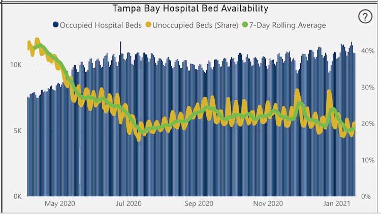
Sobush refers to the fourth graphic of the Regional Dashboard, Tampa Bay Hospital Bed Availability, as “a possible silver lining in all of this” as the metric shows hospital bed availability in the region has maintained in the low to mid 20% range since July. He, along with most health professionals attribute hospital rates not tracking along with the very significantly increasing case rates as a result of recent better understanding and treatment of the disease.
The extent of the TBP Regional Dashboard includes much more than shown here, including a breakdown of the same four metrics for each of the 8 counties individually. Additionally, the “State of the Region: COVID-19 Community Report” is a free, weekly newsletter that provides links to all the graphics mentioned here.
Click here to view the COVID-19 Regional Recovery Dashboard
Related story:
USF researchers develop web portals to map COVID-19 by ZIP code, forecast outbreaks
Enjoy this story?
Sign up for free solutions-based reporting in your inbox each week.